Helping first-time buyers feel guided through a high-stress decision
A web and mobile experience for first-time home buyers, built around reassurance, a clear next step, and costs people can actually understand.
- Client
- Nestara
- Year
- 2025
- Role
- Lead product designer
- Duration
- 6 months
- Team
- 1 PM, 5 engineers, 1 content designer
- Product strategy
- Mobile design
- Design system
- Usability testing
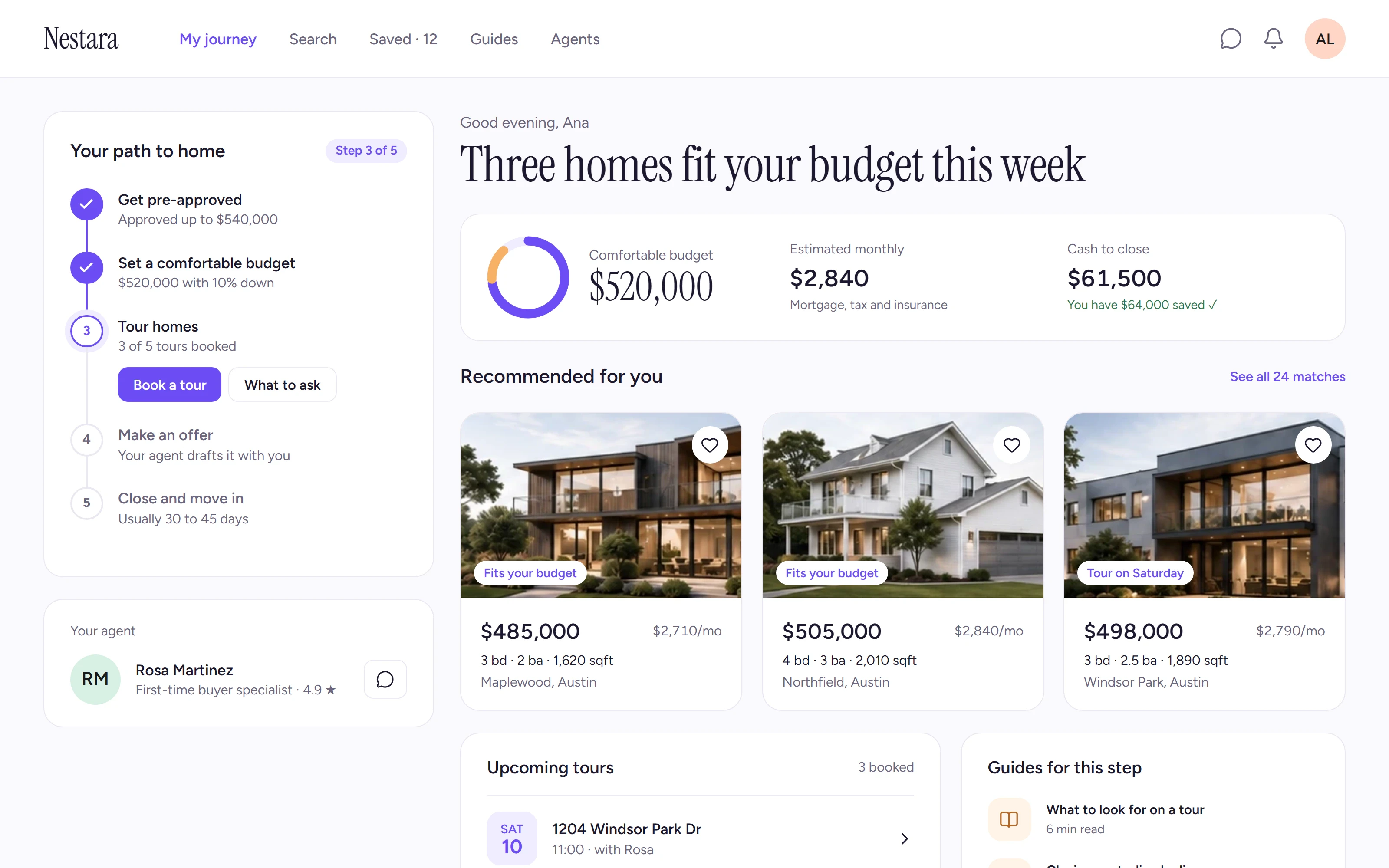
Buying a first home is one of the most stressful decisions people make, and most property apps are built for browsing, not for deciding. Nestara wanted the opposite: a product that tells you where you are and what to do next.
The problem
In interviews, first-time buyers described the process as a fog. They could find homes, but not answer the questions that mattered: Can I afford this? What happens after I tour? Am I doing this right?
What I did
We reframed the product around a five-step path, from pre-approval to closing. Every screen shows where you are on that path and the one action that moves you forward, with an agent and short guides one tap away.
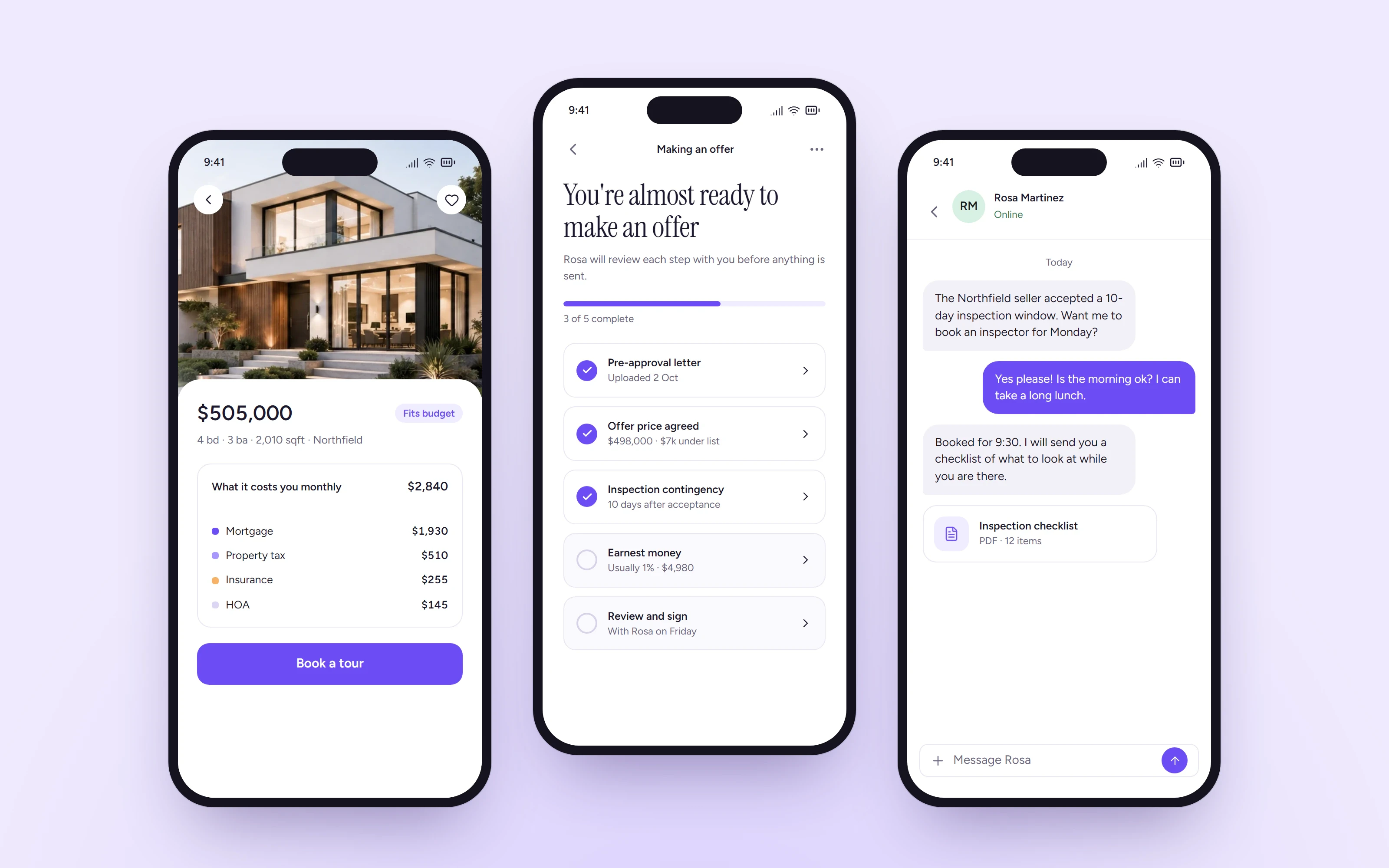
Affordability became the anchor. Instead of a list price, every home shows a monthly cost based on the buyer’s own budget, with tax, insurance, and fees broken out.
Key decisions
Monthly cost over list price. People think in monthly payments. Showing the full monthly cost on every listing removed the most common source of anxiety in testing.
One next step, not ten. Each stage of the path has a single primary action. Everything else is secondary, so buyers never have to guess what comes next.
Warmth in the details. A serif display face, soft color, and plain-language copy written with a content designer made the product feel like a guide instead of a marketplace.
It’s the first time I felt like I understood what I was signing up for.
Outcome
- more buyers reached a booked tour
- 27%
- App Store rating after launch
- 4.8
- support tickets about costs and fees
- -52%
Nestara launched in three cities with the new journey. The design system we built now powers the agent tools as well as the buyer apps.