Making legal transcripts easier to scan, summarize, and act on with AI
Nextpoint needed a calmer way to surface transcript activity, AI summaries, and open matters for legal teams already working under time pressure.
- Client
- Nextpoint
- Year
- 2026
- Role
- Lead product designer
- Duration
- 14 weeks
- Team
- 1 PM, 4 engineers, 1 ML engineer
- UX audit
- Dashboard redesign
- AI interaction design
- Design system
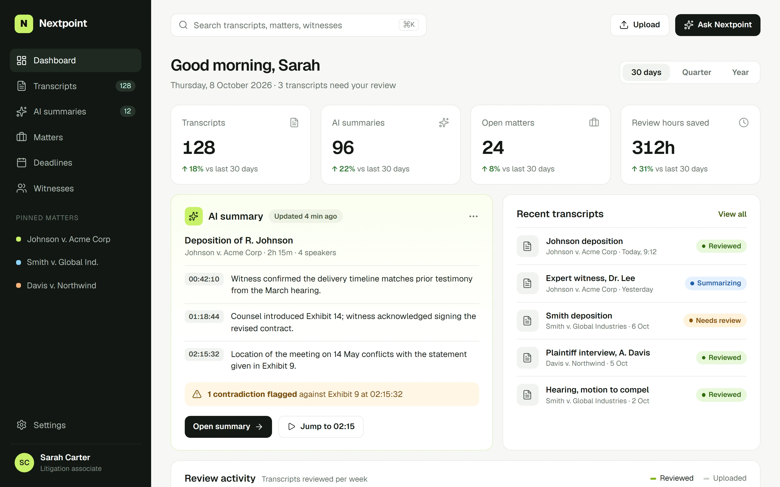
The original dashboard surfaced the right information, but never with enough priority. Litigators could see metrics, summaries, and recent transcripts, yet still had to stop and work out what mattered first.
The problem
Nextpoint’s users review hours of deposition testimony against tight filing deadlines. Interviews with eleven associates and paralegals pointed to the same moment of friction: opening the product and not knowing where to start.
- Metrics, summaries, and activity were given equal visual weight.
- AI summaries were a passive widget, disconnected from the transcript they described.
- Contradictions, the most valuable thing the model found, were buried in a list.
What I did
I started by reviewing the dashboard against the jobs people actually came to do: check what changed, review what the model flagged, and jump into the right moment of the right transcript.
The redesign is mostly about order. High-level counts come first, followed by the most recent AI summary, then recent transcripts, and finally the longer-term review activity. Nothing new was added to the page. It just reads in the sequence people work.
Key decisions
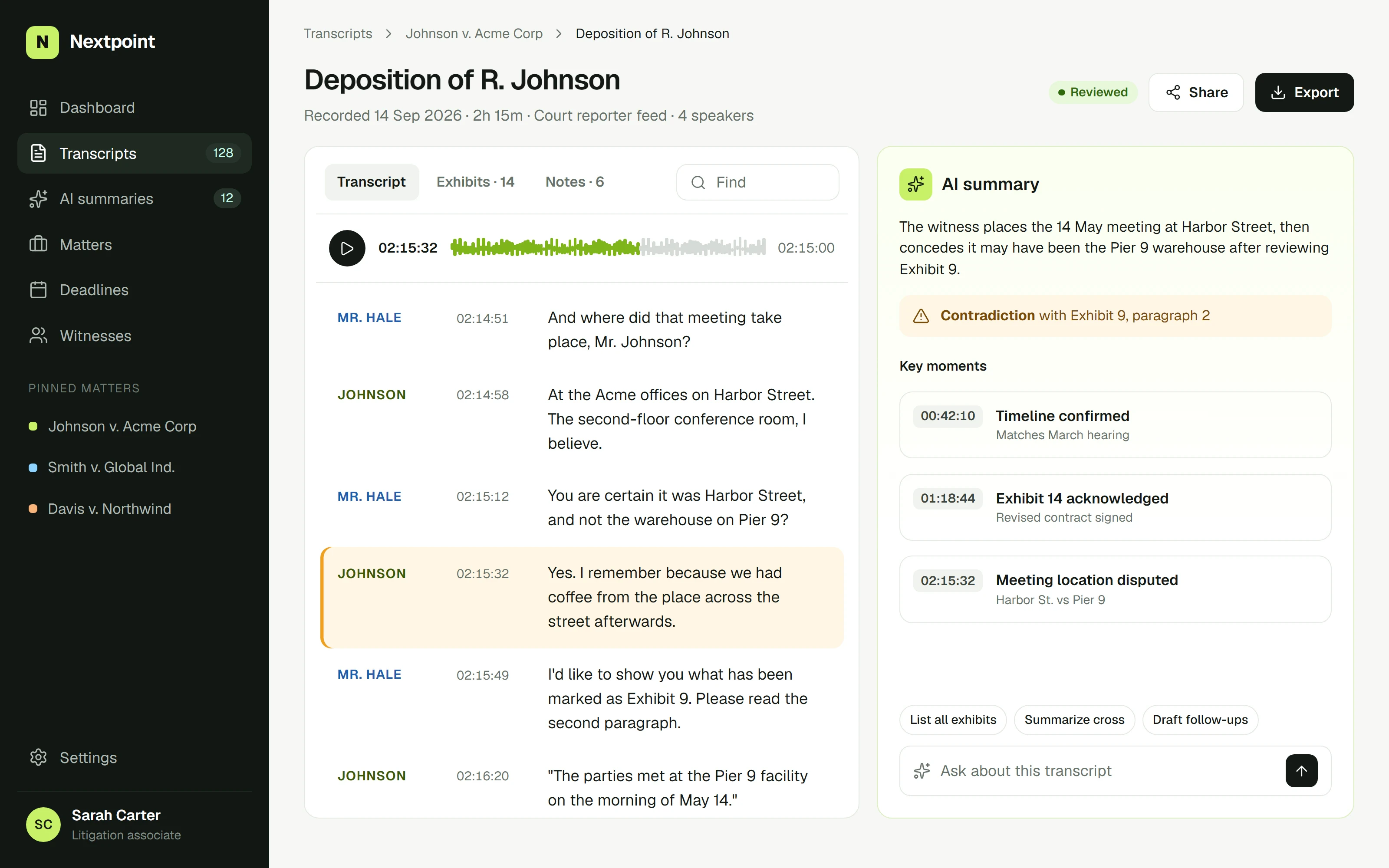
Summaries cite their sources. Every point in an AI summary carries the timestamp it came from. Trust in the model went up as soon as people could check it in a single click.
Contradictions get their own treatment. A flagged inconsistency is the most actionable thing on the page, so it is the only element that uses a warning color, with a direct “jump to” action.
Calm, not empty. Legal software gets visually heavy fast. Stronger grouping, more breathing room, and one clear primary action per card kept the page dense with information but easy to scan.
We stopped asking “where do I start?” The dashboard answers it before you think to ask.
Outcome
- faster first review of a new transcript
- 38%
- more AI summaries opened per week
- 2.4x
- of flagged contradictions reviewed
- 91%
The new dashboard shipped to all customers in the spring. The same summary pattern now runs across exhibits and witness timelines, built on the component library we set up during the project.